Blog Slices — Developer Reference
Technical reference for developers working on blog product slices. For content editor instructions on creating blog posts in Prismic, see Creating Blog Content.
Overview
Blog content is managed through Prismic CMS and rendered by the Next.js frontend. Content editors create blog posts in Prismic, add slices (reusable content blocks) to the body, and the frontend hydrates those slices with live product data from the CardNexus API.
| Component | Purpose |
|---|---|
| Prismic | CMS for content creation and management |
| Slice Zone | The body area of a blog post where slices are added |
| Product Hydration | Server-side process that collects product IDs from slices and pre-fetches them |
| Slice Components | React components that render each slice type |
Blog Post Structure
Every blog post in Prismic has these fields:
| Field | Type | Description |
|---|---|---|
| UID | UID | URL slug (e.g. my-article → /blog/my-article) |
| Title | Rich Text (H1) | Post title |
| Description | Rich Text | Subtitle/summary shown below the title |
| Category | Document Link | Links to a blog_category document |
| Tags | Repeatable Group | Links to blog_tag documents |
| Games | Repeatable Group | Links to game documents (for filtering) |
| Author | Document Link | Links to a person document (image, name, bio) |
| Date | Date | Publication date |
| Image | Image | Hero/featured image |
| Video | Document Link | Optional video document |
| Push Card | Group (non-repeatable) | Optional promotional card in the sidebar |
| Slices | Slice Zone | The post body content |
Push Card
The push card appears in the blog sidebar on desktop. It’s a promotional card with a background image, foreground logo, and a link.
| Field | Type | Description |
|---|---|---|
background_image | Image | Full artwork/background image |
foreground_image | Image | Logo overlay (supports transparency) |
link | Link | Where the card navigates on click |
The push card only renders when the background_image is populated.
Available Slices
The blog post Slice Zone supports these slice types:
| Slice | Purpose | Requires Product IDs? |
|---|---|---|
| Content | Rich text content (paragraphs, headings, lists) | No |
| Image | Full-width image | No |
| Video | Embedded video player | No |
| Quote | Blockquote with attribution | No |
| ProductHighlight | Single product card with details or price chart | Yes |
| ProductCarousel | Horizontal carousel of product cards with pricing | Yes |
| Decklist | Product list with sorting and card preview | Yes |
Product Slices
These slices embed live CardNexus product data into blog posts. They all follow the same pattern:
- Content editor adds product IDs in Prismic
- The product hydration system collects all product IDs from all slices on the page
- Products are fetched in a single batch via
product.getProducts - Each slice component reads from the shared product cache
How Product Hydration Works
The hydration code lives in apps/frontend/libs/marketing/prismic/product-hydration.ts. It scans each slice type and extracts product IDs:
- ProductHighlight: reads
slice.primary.product_id - ProductCarousel: reads
slice.primary.products[].product_id - Decklist: reads
slice.primary.products[].product_id
The product query atoms live in apps/frontend/libs/marketing/prismic/product-queries.ts.
All product slices share the same product cache. If the same product ID appears in multiple slices on the same page, it’s only fetched once.
Finding Product IDs
Product IDs are 24-character hex strings. You can find them by:
- Navigating to a product on the CardNexus explore page
- The ID is in the URL:
/explore/[game]/[expansion]/[type]/[product-slug]-[PRODUCT_ID] - Or from the staging/production database directly
ProductHighlight Slice
Embeds a single product with full details. Has two variations.
Default Variation
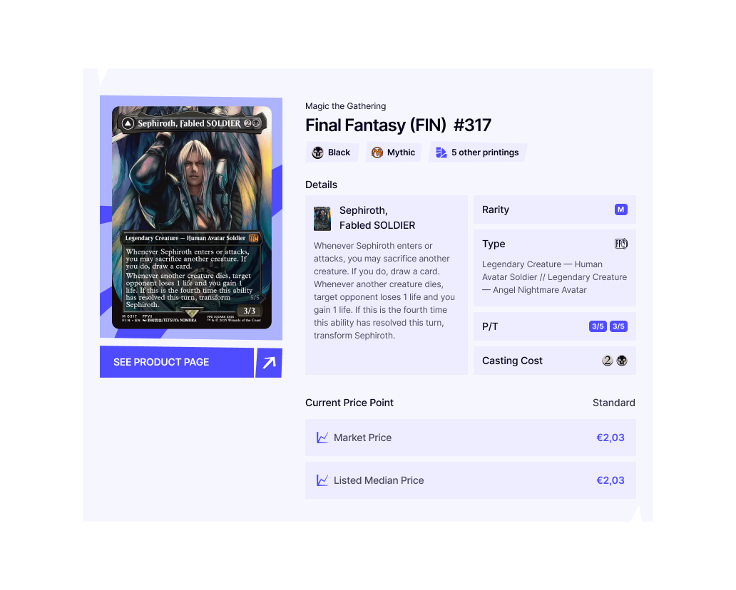
Shows a product card with image, expansion info, attributes, pricing details, and a “See Product Page” link.
Prismic Fields:
| Field | Type | Description |
|---|---|---|
product_id | Text | The product’s ID |
caption | Rich Text | Optional caption below the product card |
Graph Variation
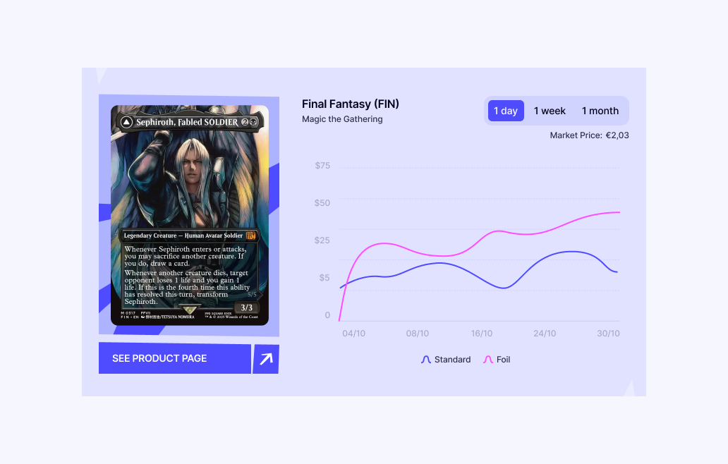
Shows a product card with a price history chart. Users can toggle between 1 day, 1 week, and 1 month periods.
Prismic Fields:
Same as default — product_id and caption.
How it works:
- The graph fetches price history via
orpc.price.getProductPricesfor both Standard and Foil finishes - Period selection uses a Jotai atom (
highlightPeriodAtom) to avoid full component re-renders - The initial load triggers Suspense; subsequent period changes use
unwrapin derived atoms for non-blocking updates - Chart data is processed through
fillMissingChartDaysto create a continuous line even with sparse data
Component Structure:
| Component | File | Purpose |
|---|---|---|
ProductHighlightGraphCard | product-highlight-graph-card.tsx | Data fetching wrapper (triggers Suspense) |
ProductCardGraphDetails | product-card-graph-details.tsx | Layout shell with card visual |
ProductCardGraphHeader | product-card-graph-header.tsx | Title, period selector (ButtonGroup), market price |
ProductCardGraph | product-card-graph.tsx | Chart rendering with line data |
ProductCarousel Slice
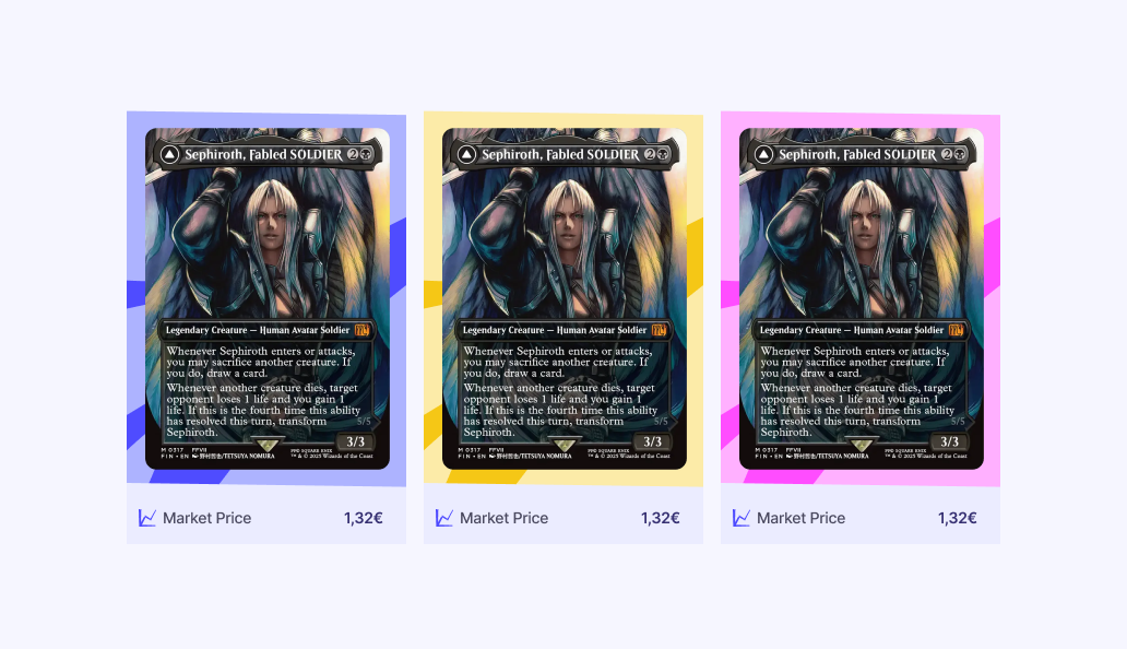
Displays a horizontal carousel of product cards with market pricing and trend indicators.
Prismic Fields:
| Field | Type | Description |
|---|---|---|
products | Repeatable Group | List of products |
products[].product_id | Text | The product’s ID |
products[].background_colour | Select | Card background: blue, pink, or yellow |
Component Structure:
| Component | File | Purpose |
|---|---|---|
ProductCarousel (index) | index.tsx | Extracts items from Prismic, wraps in Suspense |
ProductCarouselContent | product-carousel-content.tsx | Fetches products, resolves IDs to ProductDTOs |
ProductCarouselCard | product-carousel-card.tsx | Individual card with image, name, price |
Pricing Logic:
All product cards use the same pricing resolution:
- Check if product is a card (not sealed)
- Prefer
pricesByFinish.Standard - Fall back to the first available finish (e.g. foil-only cards)
- Pass pricing through
getEffectivePriceForMarketplacefor the user’s marketplace
Decklist Slice
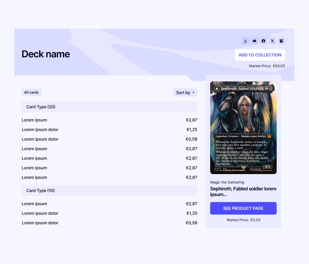
Displays a list of products with quantities, sorting, and a card image preview panel.
Prismic Fields:
| Field | Type | Description |
|---|---|---|
title | Rich Text (H2) | Decklist title |
products | Repeatable Group | List of products |
products[].product_id | Text | The product’s ID |
products[].quantity | Number | How many copies of this card |
Features:
- Sort dropdown — Sort by name, price (low/high), or default Prismic ordering
- Card preview — Hovering a row shows the card image on desktop (lg+)
- Product links — Clicking a row navigates to the product’s explore page
- Share links — Social share buttons (shares the blog post URL)
- Market price total — Sum of all card prices × quantities
Component Structure:
| Component | File | Purpose |
|---|---|---|
Decklist (index) | index.tsx | Extracts items, wraps in Suspense with skeleton |
DecklistContent | decklist-content.tsx | Fetches products via shared product cache |
DecklistCard | decklist-card.tsx | Composes header, product list, preview |
DecklistHeader | decklist-header.tsx | Title, market price, share links |
DecklistProductList | decklist-product-list.tsx | Card count, sort dropdown, product rows |
DecklistProductRow | decklist-product-row.tsx | Individual row with quantity, name, price |
DecklistProductPreview | decklist-product-preview.tsx | Card image, details, “See Product Page” button |
DecklistSortSelect | decklist-sort.tsx | Sort dropdown component + sort logic |
The Decklist slice does not use the Lists API. Products are defined directly in Prismic via product IDs. The “Add to Collection” button is planned for a future release when proper decklist/list integration is built.
Adding a New Product Slice
If you need to create a new slice that embeds product data, follow this pattern:
Define the Prismic Model
Create model.json in apps/frontend/libs/marketing/slices/[SliceName]/. Include product_id text fields for product references.
Add to Product Hydration
Update product-hydration.ts to extract product IDs from your slice. Add a case to the switch statement matching your slice_type.
Create the Components
Follow the pattern: index (Prismic props → Suspense) → content (data fetching via productsSwrAtom) → card/details (pure rendering).
Register the Slice
Add the slice to apps/frontend/libs/marketing/slices/index.ts and to the blog_post custom type’s slice zone choices in customtypes/blog_post/index.json.
Add i18n Keys
Add translation keys to both en.json and fr.json under the blog namespace.
Update Generated Types
Update apps/frontend/types.generated.ts and prismicio-types.d.ts with the new slice types.
Code Locations
| Component | Location |
|---|---|
| Blog layout | apps/frontend/libs/marketing/components/blog/blog-layout.tsx |
| Blog sidebar | apps/frontend/libs/marketing/components/blog/blog-sidebar.tsx |
| Product hydration | apps/frontend/libs/marketing/prismic/product-hydration.ts |
| Product query atoms | apps/frontend/libs/marketing/prismic/product-queries.ts |
| Price history atoms | apps/frontend/libs/marketing/prismic/product-price-history-queries.ts |
| All marketing slices | apps/frontend/libs/marketing/slices/ |
| ProductHighlight | apps/frontend/libs/marketing/slices/ProductHighlight/ |
| ProductCarousel | apps/frontend/libs/marketing/slices/ProductCarousel/ |
| Decklist | apps/frontend/libs/marketing/slices/Decklist/ |
| Blog post custom type | customtypes/blog_post/index.json |
| Slice registry | apps/frontend/libs/marketing/slices/index.ts |
| i18n (English) | apps/frontend/libs/shared/i18n/locales/en.json |
| i18n (French) | apps/frontend/libs/shared/i18n/locales/fr.json |